In the digital age, the balance between user experience design and user rights protection has become a key challenge in product design. This paper delves into the contradiction between user-guided design in improving product conversion rate and respecting user rights, analyzes common design strategies and their potential risks, and proposes specific paths to achieve a balance between the two.

1. Introduction
Remember the first time you downloaded an app? The interface is refreshing, the buttons are eye-catching, and a “start a beautiful journey” makes people can’t help but click on it. Then, it pops up a request: “To better serve you, we need access to your contacts, locations, albums、…… and even respiratory rate. You hesitate for a moment, but find that the “Allow” button glows red, while the “Reject” is almost gray and almost out of sight. So you think, “Forget it, I’ll order it first.” “Congratulations, this is the classic routine of user-guided design.
User guidance is originally intended to help users get started and lower the threshold, but under the pressure of pursuing conversion rates, it sometimes becomes a kind of “gentle control”. You think you have made a choice, but in fact you are pushed forward by design.
This is the contradiction between experience optimization and user rights. On the one hand, there is conversion rate, activity, and retention curve; On the other hand, there is the user’s right to know, choice and trust. Designers often stand in a dilemma: “If this button is more prominent, the conversion rate will increase; But users may feel uncomfortable……
Over time, the product is becoming more and more “smart”, but users are more and more suspicious: am I using the product, or am I being used by the product? What’s more serious is that this kind of “too forceful” guidance may also step on red lines such as privacy leakage, acquiescence consent, and cancellation difficulties. In the short term, it seems to retain users, but in the long term, it may lose trust or even lose the market.
So here comes the question:
Does user guidance have to come at the expense of rights and interests?
Is it possible to do a good job in experience optimization while also making users feel “I am respected”?
Can you find a “win-win” way between conversion rate KPIs and user satisfaction?
The answer is: of course, and it must be possible.

What does a product manager need to do?
In the process of a product from scratch, it is not easy to do a good job in the role of product manager, in addition to the well-known writing requirements, writing requirements, writing requirements, there are many things to do. The product manager is not what you think, but will only ask you for trouble, make a request:
View details >
A mature designer is not “let the user click and it’s over”, but to think: Is this design really beneficial to the user? Are they given enough options? Is the message they need to know clearly conveyed?
Experience design is not black magic, it should be a “warm technology” based on respect, transparency and win-win. Users are not afraid of being guided, they are afraid of being “tricked”. If we design the guidance to be more humane, clearer, and more controllable, users will be more willing to stay, and even smile knowingly: “This App, understand me.” “This is the focus of what we will talk about next: how to find that impartial and just right balance between experience optimization and user rights.
2. Basic concepts and theoretical frameworks
1. User guidance
When it comes to “user guidance,” you can think of it as a gentle waiter who quietly walks up to you when you first walk into an unfamiliar restaurant and says, “Hello, this is the menu, this is today’s recommendation, if you are here for the first time, I recommend starting with this signature dish.” “Doesn’t that sound intimate?
In product design, user guidance is such an existence. Through interface design, button position, interaction rhythm, and even copywriting tone, it quietly takes you to complete registration, fill in information, bind mobile phone numbers, subscribe to members, and finally quietly say: “Payment successful, thank you for coming.” ”
There are many common forms of user onboarding:
- Just after registering, open the App, and have a wave of “onboarding” welcome process to familiarize you with each function;
- When you click on a certain operation interface, the system pops up a “progressive prompt” telling you “Click here and try it”;
- By default, check an option (such as “I agree to receive various pushes”), and you pass it with one click without paying attention.
From a design point of view, these means are not “bad guys”, and their starting point is quite justified:
First, help users get started quickly and lower the threshold for use;
The second is to improve the conversion rate of products, after all, allowing people to register, use, and pay is the “OKR” of each product team.
Reasonable guidance is like “novice teaching” when playing games, with rhythm, logic, and guidance, and users learn quickly and are willing to stay. This is why we often say, “A good bootstrapping experience can directly determine whether a new user is ‘uninstalled in seconds’ or ‘falls in love with you’.” ”
But then again, guidance, if it is too “enthusiastic”, it is easy to make people feel “on top”. Once guidance becomes a “routine”, the problem arises. For example, some apps guide you to open a membership, and write “automatic renewal after 3 days of trial” as small as an ant, but the button is as big as a billboard. For another example, if you click on 5 pages to unsubscribe, you will be asked to “confirm that you really don’t need us anymore?” At this time, users may already be thinking: “I just want to cancel a subscription, how can it feel as difficult as breaking up…… these are the “deformed versions” of guidance. Deliberately hide information and create misleading, allowing users to “click on an option they shouldn’t have clicked” or “agreed to something they didn’t want to agree” without knowing it.
What’s more serious is that this design not only makes people feel “annoying”, but may also infringe on the basic rights and interests of users:
- You are subscribed without seeing clearly, and the money is quietly deducted;
- You think you have turned off positioning, but it’s still running in the background;
- You try to quit the service, and the “exit” is hidden even harder to find than “Tomb Robbery Notes”.
Therefore, user guidance is like a double-edged sword: if it is well designed, it is the “guide” of users; Poor design makes it a “trap maker”. Excellent product guidance is not to let users “have no choice”, but to help users make better choices – while retaining the right to “choose not to do it”. Users are not fools, they are just busy. They are willing to be guided, but they do not want to be manipulated. What we need to do is not to design a process that “makes it impossible for users to refuse”, but to create an experience where “even if the user refuses, they are still willing to stay”.
2. User rights and interests
After saying so many guidance routines, you may ask, “What rights should users have?” Can the product be ‘designed’ by me? “Of course not! The user is not a puppet at the mercy of the user, but a “living person” with flesh and blood, emotions and judgment. More importantly, they should also have a set of basic rights protection mechanisms. You can think of these rights as the “Charter of User Human Rights in the Digital World”, let’s look at them one by one:

1. Right to know: I have the right to know what is happening
The most basic one is called the “right to know”. It’s just that you don’t tell me anything until you can’t let me make a decision. For example, you open an app, it suddenly pops up saying “We need access to your microphone and camera”, and you think, “Eh, I’m just checking the weather, why should I turn on the camera?” At this point, if it clearly tells you “We want you to record a voice broadcast of the weather”, you may click “Allow”. But if you only say “for a better service experience”, then …… It’s a bit suspicious.
The right to know means: you have to explain the purpose, content, and consequences clearly, and don’t let users “agree” with a confused face.
2. Right to consent: I only count when I say it
After knowing, the user must “consent”, which is the “right to consent”. If you didn’t tell me, I would automatically default to “agree”, let’s talk about “you love me”. And if the consent is clear and active, it is not the kind of fake consent that “gray font, small buttons, and hidden in the corner”. You can’t check the “I accept all terms” option by default, and also have a big red “next step”, which is not called consent, this is called “routine”.
3. Right of withdrawal: You must retain the right to repent
How can a person not regret it? You like milk today and want to drink soy milk tomorrow, which is normal. Therefore, in product design, users must also have the “right of revocation”. For example, I subscribed to a certain service, found it useless, and wanted to cancel it – you can’t let me click back and forth, and let me “contact customer service to unsubscribe”; Or I authorized you to access my location information, and now I feel uneasy, I should be able to turn off the permission instead of being “locked” by the system.
Good design is not afraid of users regretting it, but what is afraid is not giving users the opportunity to regret it.
4. Data control: This is mine, not for you to use
When it comes to data, it’s even more sensitive. Whose data? It’s mine. Whose photos, chats, and location information? It’s still mine. This involves “data control”. Users should be able to decide whether their data is collected, how it is used, whether it can be exported, and whether it can be deleted. For example, if you register an app, you don’t want to use it for a while, but you have to send an email, queue up for review, and wait for ten days to delete an account, this experience is not as simple as applying for a passport.
Users’ data is not the private property of the product, and it is designed to give users the “key to master their own data”.
5. Right to freedom of use: Don’t let me “be forced to do business”
The last one sounds very “Buddhist”, called product design “freedom of use” product design. What do you mean? I can use you or not all the time, and which part of the function I use depends on my wishes. For example, an app that requires you to turn on positioning, notifications, and push to use it normally, which is not called “freedom”, this is called “obstacle”. Not to mention that some products engage in “forced updates”: if they are not updated, they will not be used, and there will be more advertisements when they are updated – do you think users can not be angry?
The essence of freedom of use is “freedom of choice” – I came because I liked it, not because I was “forced” into it by you.
To sum up, in product design, the “five-piece set of basic rights and interests” that a user should have is:
- Know what I did (right to know)
- I will do it only if I agree (right to consent)
- If you don’t want to do it, I can take it back (right of withdrawal)
- I am in charge of my data (data control)
- I have the final say on how to use it and how much to use (right to use freedom)
Don’t underestimate these seemingly “deserved” rights, in many designs, these are precisely these that are quietly “ignored” or “downplayed”. As designers and product people, our real responsibility is not “how to guide users to make decisions”, but how to make them feel at ease, free and respected when making decisions.
3. The theoretical root cause of the contradiction between the two
When it comes to the battle between business interests and user rights, it’s like “chicken or egg first”, and every product team may argue about “fast!” To improve conversions, we want to grow”, another voice “Slow, don’t scare away users, we still have to stay for a long time!” This is the classic opposition between “maximizing commercial interests” and “protecting user sovereignty”. So short-term growth vs. long-term trust: which one do you choose?
Many companies, especially in the early stages of entrepreneurship, are most concerned about “conversion rate”. As long as the user clicks “pay”, “subscribe” and “bind mobile phone number”, everyone immediately cheers: “Good! KPIs are kept! But if you ask the user, “Are you voluntary?” He may roll his eyes and say, “I thought I wouldn’t be able to use this step if I didn’t do it…… This is a typical short-term experience optimization: everything is designed to convert quickly and activate quickly, and it is very “smart”, but not necessarily “kind”. You win the data, but you may lose trust.
Instead, long-term trust building is like raising a pot of green plants. You can’t expect it to grow 10 centimeters just by watering it once, you have to take care of it slowly, don’t be too violent, don’t be too fast. You want users to know: “I’m not fooling you, but I really care if you want to stay.” ”

Looking at this issue from these three perspectives, each has its own difficulties
a. User perspective: convenience vs. autonomy is a real dilemma
From the user’s point of view, it is actually very entangled. On the one hand, they want the product to be “as simple as possible” – it is best that I can register, pay, and log in with two clicks; But on the other hand, they want to be “in charge”, don’t acquiesce to my “all-vote consent” in everything, and don’t even let me retain the right to “who I am”. It’s like ordering food at a restaurant, of course you want the waiter to move quickly and serve the food quickly, but you also want him to ask you if you have allergies and eat spicy food, instead of directly serving a table of “the hottest in the store”.
b. Product perspective: growth efficiency vs. brand trust
Looking at the product side, the pressure is not small. The boss talks about “growth, growth” every day, so the design team seizes the time to do various optimizations, default options, induction buttons, and pop-ups in turn. It can indeed bring short-term conversions, but the problem is that as long as users are disgusted once, it is difficult to win back. This is a multiple-choice question between growth efficiency and brand trust: do you want to “make a quick money first”, or are you willing to “slowly build up user favor” and finally reap their “long-term repurchase + true love fans”? If you’re McDonald’s, it probably doesn’t matter; But if you are a platform for health, education, and long-term service, trust may be more valuable than conversion rate.
c. Legal perspective: legal compliance vs. risk avoidance
Don’t forget, there is also a role that “can see everything you do” – the law. Like the EU’s GDPR, it is the big boss on the side of user rights, which requires products to clearly inform the purpose of data, obtain user consent, and allow revocation at any time. This pair of “design routines” is a critical hit. Many foreign products were fined so much that they began to honestly rectify the “cookie pop-up”. From a legal perspective, products must be trade-offs: you can pursue conversion, but the product design must be “legal and compliant”; You can do data analysis, but not “sneak in”. The law is not the antithesis of the designer, it is a sentinel that reminds us not to cross the line. Otherwise, if you design “cleverly” today, you may receive a huge fine tomorrow, “happy to mention hot searches”.
3. Core strategies and potential risks of user guidance
Let’s now take a look at those design tips that “look inadvertent, but are actually very scheming”. It often appears on registration pages, subscription pages, and permission pop-ups, gently exerting pressure, and even making you click “agree” without realizing it, and then never turn back.
1. Visual and interactive design guidance
1.1 Design strategy
Highlight CTA buttons: Change colors, and magic goes live
Have you ever noticed that every time an app pop-up asks you to make a decision, the “Agree” or “Continue” button is particularly conspicuous? It’s either red or bright blue, and it may be jumping there, as if winking at you: “Click me, click me”. Classic highlighting CTA design techniques. Brush the “options you want you to click” to the center of your eyes through color, size, and animation effects, so that you have almost no hesitation.

“Weaken” rejection option: It’s not that you won’t be allowed to refuse, it’s that it makes it difficult for you to find out how to refuse
This kind of design is simply a textbook case of “grayscale strategy”. For example, if an app asks you to “accept personalized recommendations”, there is a big bright button on it that says “Open a wonderful experience”, and a row of gray small print below “talk about it later”, and it also uses a font size that your grandfather can’t see clearly. The user’s subconscious will think: Is it impossible to use it without clicking “on”? Is it something that will be missed by “talking about it later”?

Progress bar pressure: Halfway through, why don’t you finish walking?
Let’s talk about the progress bar. Many products will use a progress bar when guiding newbies, such as “1/3 complete settings” and “2/3 open permissions”, which is updated as you go, ostensibly to motivate you to complete the process, but in fact it is giving you psychological pressure: “You have filled in here, why are you embarrassed to quit?” “It’s only the last step, we’ve all persevered, do you want to have a big gift package?”

1.2 Hidden risks and solutions
While these designs ostensibly increase conversion rates and speed up the process, from the user’s perspective, they actually weaken the choice and even “mislead” users to some extent:
- You think you can’t continue without clicking “allow”;
- You think the progress bar is a process that must be completed;
- You click “agree”, but you don’t see clearly what you promised
The result is: anxiety rises, trust falls. Many users will choose to uninstall, complain, or silently lose because of this kind of guidance – this is the same as being tricked in love, “once you are deceived, you will never love it”.
In fact, guidance is not a problem, the question is whether it gives users real choice. So we can change to a “more honest and warm” approach:
- Make all options equally obvious: since the user can “agree”, they should also be able to easily “reject”. The button size, color, and copywriting clarity should be fair, and don’t play the “color game”.
- Provide a clear exit path: If users don’t want to continue, let them explicitly “jump out of the process,” “close the pop-up,” or “talk about it later” instead of getting lost on the page.
- Add a little explanation and trust tips: “We are requesting this permission to better recommend content, and you can turn it off at any time” is transparent and reassuring.
2. Default options and preset behaviors
2.1 Design Strategy
The default “sweet trap”: Before you speak, it will answer for you
Let’s imagine a scenario: you open an app that looks useful, and it says, “Try it for free for 7 days, come and try it!” You think, “Hey, this is good, I like free prostitution.” So you click “Try Now” and happily enter the new world.
But! Early in the morning of the eighth day, you woke up and saw that the bank card was suddenly missing more than 30 yuan. It turns out that when you click “Trial”, you check “Auto-renew after the trial ends” by default, and you don’t know that this option is hidden in a small gray corner.
Isn’t it a bit like the “free tasting” promotion, where you are pulled to buy a whole box after one bite?
Agree to share by default: Quietly tell the world who you know
There is also a more hidden routine, that is, social sharing is turned on by default. For example, a newly installed app flashed lightly when it was opened for the first time: “We will automatically read your address book to help you find friends~” You didn’t think much about it at the time, and clicked “Allow” in the blink of an eye.
As a result, a few minutes later, your mother’s best friend, your elementary school classmates, and your boss’s boss all received a prompt notification for you to join the app, and the embarrassment value soared instantly. What’s even more frightening is that you don’t even know that you have allowed it to access the contacts, photo permissions, location data, and take away a circle of friends to “automatically sync”. It’s like you just moved to a new home, but the landlord told the whole community your address by default, and also thoughtfully included a selfie of you. This is already on track for a long time, and it is not uncommon for user information to not be properly handled in the early days of the Internet.
2.2 Hidden risks and solutions
The essence of these designs is that before the user clearly says “I do”, they default to your “yes”. The problems they pose include:
- The user provides personal data without their knowledge;
- In the name of “free”, it was inexplicably automatically deducted in the end;
- After realizing it, the user wanted to go back, but found that the process was as complicated as solving an equation.
- From the user’s point of view, this is the standard “passive trick”; From a product point of view, this is an overdraft trust in exchange for short-term gains.
So what should we do? Use “sincerity” and “transparency” to fight against “routines”
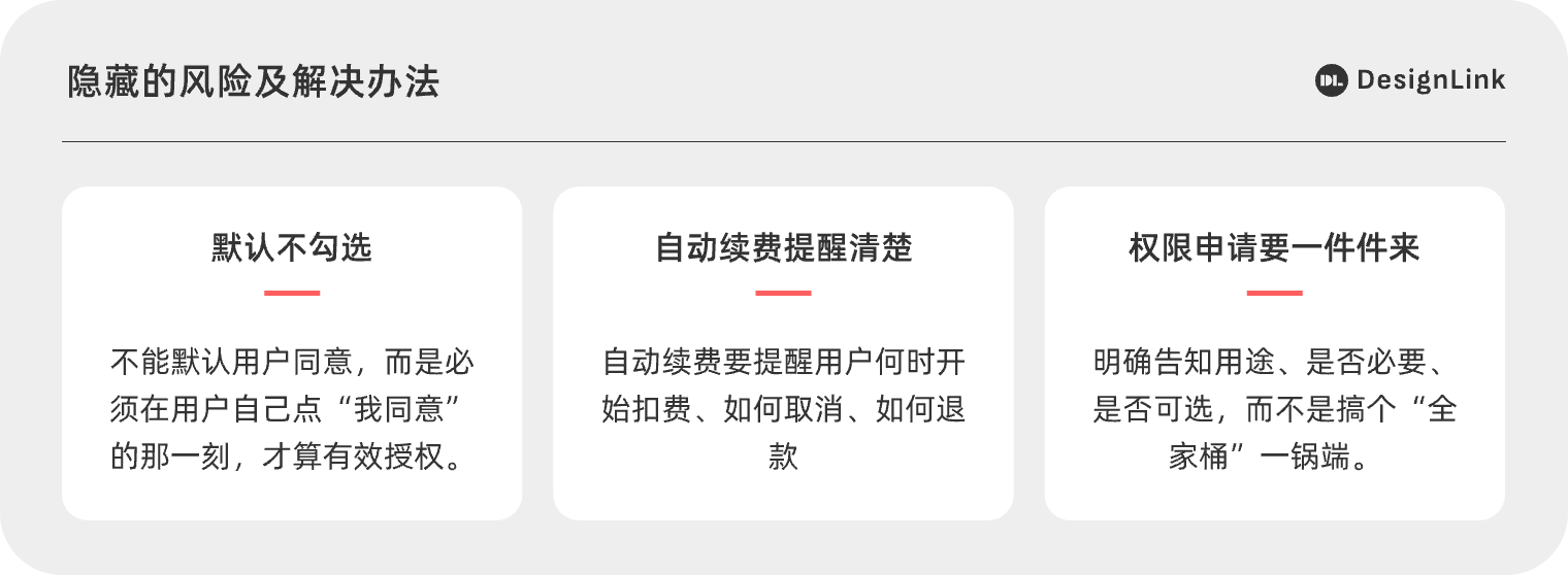
- Unchecked by default: This is actually an explicit requirement of laws and regulations such as GDPR in the EU – you cannot default to user consent, but must be valid authorization at the moment the user clicks “I agree”. After all, privacy belongs to someone else, not a rental contract that you can sign on your behalf.
- Auto-renewal, remind clearly, and be easy to refund: you can offer a trial or set up auto-renewal – but remind users in advance when the deduction will start, how to cancel, how to refund, and the cancellation process should be as easy as the original subscription, don’t engage in “one click to subscribe, five steps to cancel”. This situation still exists, such as an antivirus software. Do you understand?
- Permission requests come one by one: the address book is the address book, the position is the position, and the microphone is the microphone. Before each use, clearly inform the purpose, whether it is necessary, and whether it is optional, instead of making a “family bucket” one-pot end.

3. Misleading copywriting and decision-making psychology
Vague terms: When you click “I agree”, you don’t actually know what you agreed to
When it comes to “user agreements”, I guess 90% of you haven’t read them seriously. Why? Too long, too winding, too difficult to understand. The design often buries the information that really matters in parentheses in Article 27.6, for example: “We reserve the right to automatically renew without notice”, “You authorize us to use the information for referral services and partner promotions”
You think you just registered an account, but you hand over your bank card, browsing habits, and friend list “by the way”. The risk of this kind of “information hiding technique” is that users make “consent” without understanding it, but they are actually passively losing their rights.
So what should we do? Be an honest designer and a smart user
- Don’t be too greasy in copywriting: Don’t mess with those headline parties that “this wave will not cry tomorrow”, users are not fools, and they will be annoyed after a long time. Truthfully expressing preferential information and communicating in friendly, honest and plain language is sustainable “flirting”.
- Before making a decision, help users clarify the key points: For example, before you are about to deduct the fee, a pop-up prompt will say “You are about to pay XX yuan/month, you can cancel at any time”, which will make people feel much more at ease. Don’t feel the tension of “pay quickly, or the button will disappear”.
- Clearly list the key terms: the user agreement can be long, but key points – such as whether to renew or share data – should be highlighted in advance. You can use cards, Q&A, and tips to understand at a glance.
4. The difficulty of withdrawal and cancellation
4.1 Design Strategy
Let’s restore a real user scenario: you’ve made up your mind to cancel a service that deducts you monthly.
The first step is to click on the account settings, okay, and find “Subscription Management”.
The second step, where is the “cancellation of membership”? Why do you only see the “upgrade plan”? You scroll down, turn left, and finally find “Other Questions” in small gray print.
The third step is to click in – you will be taken to a questionnaire page, and you must also fill in: “Why are you leaving us?” ”
While perfunctorily choosing “content is not interested”, you think, “This is no longer a question of whether you are interested or not.” ”
Complete the questionnaire? It’s not over yet! The system continues: Please contact customer service to further confirm the cancellation process.
Is it déjà vu? This is a typical “exit obstacle design”.
How many common “riot operations” have you been recruited?
Multi-level cancellation process: Want to cancel? Sorry, please go through the four-step process first: click on Settings > to enter the FAQ > fill out the questionnaire > contact customer service. It’s more complicated than signing up for a driving school.
Cancel button “missing”: You can’t find the cancellation entrance after searching for a long time, it’s hidden in a drop-down menu, a secondary page, or even an inconspicuous corner. Some people jokingly call this “canceling peek-a-boo”.
Cancellation means “emptying everything of you”: Some products will also say: “After cancellation, your historical data will be deleted immediately and cannot be recovered!” All of a sudden, you hesitated: Huh? What should I do with the materials I collected in those years? Should we weigh it too much?
4.2 Hidden risks and solutions
The complexity of these cancellation processes is actually a deliberate creation of psychological thresholds. The harder it is to cancel, the more likely it is to stay still. But will you be happy? The real reaction of most users is: “I don’t stay, I can’t escape.” This feeling of being “trapped” can seriously damage trust in the brand over time.
Don’t look at the deduction you keep the user for a month, and he may not come again next time – not to mention word of mouth.
The complexity of these cancellation processes is actually a deliberate creation of psychological thresholds. The harder it is to cancel, the more likely it is to stay still. But will you be happy? The real reaction of most users is: “I don’t stay, I can’t escape.” This feeling of being “trapped” can seriously damage trust in the brand over time. Don’t look at the deduction that you keep the user for a month, he may not come again next time, not to mention word of mouth.
- Provide one-click cancellation: Just like “confirm payment” is done with one click, canceling is also possible. If users really want to stay, they will stay. Putting up barriers is counterproductive.
- Cancellation is not severance: you retain access to your data for a period of time after canceling, such as “the account will be permanently deleted after 30 days, during which you can restore it.” This is not only gentle, but also professional.
- The cancellation process is also an experience: you can ask appropriate questions and offer alternatives in the cancellation process, but please be “understanding and respectful” rather than “holding you back”.
4. A balanced path between design ethics and experience optimization
1. Real choice: Let the “right to choose” become a real right
For example: You download a new app and a page pops up as soon as you open it: “We take your privacy very seriously, please click ‘Agree’ to continue using it.” “Look around, where is the “disagreement”? There are no buttons, no skips. You had no choice but to click “agree” and thought, “This is not my choice, this is being forced to help!” “This is the classic operation of pseudo-selection. Hiding “disagree” or simply not giving you this option is tantamount to saying: you can choose – but you can only choose the one I want you to choose.
1.1 The real choice should be equality, honesty, and no routines
There’s an old saying in the design world: “Choices make or break the direction of the experience.” The product only raises the big red buttons of “Agree”, “Continue” and “Start Experience” on the interface, and hides “Disagree” and “Close” in gray small print, or simply does not select it, which is to put it bluntly, it is to use visual skills to force users to follow the path they have arranged. Some clever (but not kind) designs end with the sentence: “Skipping this step will automatically start the service after 30 days.” You think you have chosen not to accept it, but in fact the system has already made an “extension of consent” for you. This is not a choice, this is a “routine guidance” dressed in the cloak of freedom.
1.2 Give users a real “decide later” opportunity
Like a considerate friend, not like a sales reminder. When the situation is not yet clear, the designer can leave a button that says: “Talk about it later” or “Let me see it first”, so that the user has time to weigh and consider. For example, when requesting permissions, don’t come up: “If you don’t give permissions, you won’t let them use it”, you can prompt: “We need these permissions to provide a more complete experience, you can turn them on at any time in the settings.” In this way, users will not only feel your sincerity, but also will not feel “blackmailed”.
1.3 True choice is a manifestation of respect
In the final analysis, the right to choose is not a decoration, but a basic right that every user should have. When a product does it: every step of the operation can be freely decided, every “disagreement” can be accepted, and every “skip” is not a burden – then you are not far from “building user trust”. After all, users don’t want to click “agree”, they just want to confirm whether this “agree” is what they “really want” to order.
2. Information transparency: let users “know what they are doing”
2.1 Optional instructions
Do you still remember the last time you shopped online, you saw a product marked “only 9.9” and happily placed an order, only to find that the last payment was 29.9 plus shipping, packaging, and handling fees? Do you feel like you’re being “routined”? If important information is hidden in the corner of the product design, it is like buying a blind box for users: it depends on guess before dismantling, and after dismantling, you can only accept your fate.
Fees, privacy policies, data uses, permission requests are not “optional” small print instructions, they are key clues for users to decide “whether to continue”, they must be put in front, clearly and clearly!
2.2 Speaking human words is more sincere than piling up terms
Let’s talk about those “agreements that look like they are written to lawyers”. Some apps throw you a large user agreement when you open it, which looks dense and like ants, and a bunch of “that is, you are deemed to know and agree to the entire content of this agreement” – seriously, most people can’t stand it at all, and read it as if they are memorizing the political provisions of the college entrance examination, with a question mark on their face: What did I agree to?
In fact, most users are not lazy, but they can’t understand, are hard to find, and too hard to remember. The solution is simple: don’t drag the terminology, just talk about human language. Like what:
- Instead of writing “We may collect device identifiers based on your authorization to optimize recommendation strategies,” you can say, “We will recommend appropriate content based on the phone model you use, but you can turn this off at any time.” ”
- Instead of burying the “permission request description” after page 20, you might as well write directly when requesting camera permission: “In order for you to be able to upload your avatar, we need to use camera permission.” ”
2.3 Information can be found at any time
Another thing is also crucial: information must not only be said in advance, but also available at any time. It’s like your friend telling you, “I wrote the Wi-Fi password on a piece of paper, find it yourself.” “Then you rummaged through half the house and couldn’t find that piece of paper, and finally carried it all night with your own traffic.
If the app tells users that “we protect your data rights and interests, you can view and manage it at any time” – then make this “anytime view” really available at any time. Don’t hide it in the five-level menu, and don’t only appear once when registering.
A little trick is: you can put a “My Data and Permissions” section on the settings page, clearly listing what information you have stored and what users can do, such as exporting, modifying, deleting, etc., so that users can make decisions without guessing or struggling.
3. User control: Let the “decision power” run throughout
Imagine that you subscribe to a fitness plan app, and your blood boils for the first few days, and doing push-ups is like chicken blood. But on the seventh day, you suddenly woke up: “I actually prefer to lie flat.” So you click on the App to cancel the subscription – the result button is hidden in the seven-layer menu, and you have to fill in the “Why did you give up becoming beautiful” questionnaire, which cannot be canceled immediately and has to wait for 30 days to take effect. At this time, do you particularly want to shout: “This is a fitness program, how can it feel like signing a lifetime contract?” “User control, to put it bluntly, is to allow users to “turn back” at any time during use, without explaining too much, without being kidnapped by “for your own good” care, and without looking for a “way out” in the maze.
The three keywords of control: anytime, clear, and easy to operate
3.1 Change your mind at any time
Just because a user is willing to turn on notifications today doesn’t mean they won’t close it tomorrow morning because it’s “too noisy”; Just because you’re willing to share location information today doesn’t mean you want to reveal your whereabouts when you’re on a business trip next week. Therefore, things like permission authorization, notification push, marketing subscriptions, etc. should allow users to revoke or modify them at any time. Not “turned on, cannot be closed”; nor is it “customer service needs to be contacted when closed”; Instead, with a little click, you can return to a peaceful life. This is the true respect for people’s freedom of choice!
3.2 Data management should be as visible and accessible as the things in the refrigerator
Many products like to collect data, but few products really let users manage them. Ideally, users can easily export their data, delete their accounts, and modify their personalization preferences. Just like when you find yesterday’s fried chicken in the refrigerator, you have the right to decide whether to eat it hot or throw it away directly, rather than being “locked into the kitchen” by the platform and not touching it.
3.3 Don’t let the “unsubscribe” button look like peek-a-boo
What I fear most is the “dark design” – for example, the unsubscribe button is as small as an ant, and the color is so gray that it is almost invisible, and you have to skip five “Are you sure?” To succeed. In fact, these are all tricks for the product to “keep users for a while”, but the problem is: if you rely on hidden buttons to keep people, then users will not be sincere in staying.
A reassuring product should be “you want to go, the exit is there”, not “you have to wade through mountains and rivers to leave me”.
4. Sustainable experience: Implant user trust mechanisms in business goals
In design, we often hear “user guidance” as if guiding the way in a forest. The guidance is correct, but the problem is that some road signs are deliberately crooked, and some trails are actually “trap paths”.
4.1 Responsible experience design requires three ethical bottom lines:
- Explicit rather than implicit: Want users to make decisions? Then tell him clearly what happened, and don’t use “little gray words” to secretly hide the key content.
- Choose instead of default: Don’t automatically check “Subscribe to me” and “Allow me to collect your family photos” as soon as they come up, giving users the right to make decisions.
- Voluntary rather than forced: Twisted melons are not only not sweet, but may also make people see your watermelon stall in the future.
4.2 User trust is like a glass, crystal clear to drink with peace of mind. The guidance mechanism should be triple transparent:
- Data transparency: Explain the purpose, scope, and usage of data collection
- Transparency of rights: Inform users of the scope and method of data that can be accessed/modified/deleted
- Operational transparency: Any critical behavior can be undone or adjusted
4.3 Balancing: Business Goals ≠ Users Are “Pinched”
Many times, product designers are walking a tightrope, with the boss shouting to grow and convert; On the other side, the user looked at you carefully: “Are you taking this step for my own good, or do you want to trick me?” So we need to practice the “balancing technique”, here are a few cheats:
- Set decision points centered on the user: At key nodes in the journey (such as registration, payment, sharing), we must stand from the user’s perspective and give them options that they can understand and choose clearly.
- Secondary confirmation mechanism: For some sensitive or irreversible operations, such as fee deduction and data deletion, you have to “ask again” to avoid users regretting doing things with shaky hands.
- Clarify the exit path & feedback channel: the user wants to go, do not stop; You can also tell him: “If you are not satisfied, tell me, we really listen.” ”
- A/B testing + ethical self-check: Don’t just look at which version has a “high conversion”, but also see if users are “uncomfortable” because of your design. Data is not only used to “improve KPIs”, but can also be used as a human detector.
5. Establish a sustainable experience and rights balance model
How to build a stable and non-annoying user experience and equity balance model. To put it simply, don’t patronize the sprint to grab users, you have to think about marathon people to “stay, run far, and like you”.
1. Three-stage design review mechanism
If we compare a function to building a house, then other people’s houses are built and then curtains, and some products are designed to “pull people into the house first and then build walls”, and the result is that the user finds that as soon as he enters, he can’t open the window, he can’t find the door, and he doesn’t even know where to get out. Therefore, if you want to live comfortably in the house, the design must be “three-stage construction acceptance”, which is divided into three steps:

- Initial stage – confirm that “users are willing to come”: At this stage, we are not in a hurry to draw a guidance flow chart, but have to ask ourselves: “Is this operation really what users really want?” Or do I want him to feel like he wants it? For example, if we are a fitness app, before “guiding the purchase of an annual pass”, we must confirm that the user really intends to exercise for a long time, rather than just downloading it and not even familiar with the interface.
- Intermediate stage – check “user understanding”: At this point, we need to test whether the user is in control of the onboarding process. Is there “only a huge green ‘continue’ button”, is there “small gray text that says ‘skip'”? Is the path clear? Are the options equal? If the process makes users feel “forced to move forward”, it has to be adjusted.
- Later stage – listen to “user feedback”: the real beginning is after the launch. The product cannot be “closed as soon as it is launched”, but a user feedback mechanism must be established: collect “where it is uncomfortable”, where there are “misunderstandings”, and where it is “repeatedly pitted”, and then continue to adjust and optimize. This three-stage mechanism is not only a self-inspection tool, but also a safety belt for “preventing design accidents”.
2. Benign design model
Now let’s talk about an ideal state, called the “benign design model”. This model is like the “four-dimensional personality” of the product world, which makes design not only profitable, but also not annoying.
2.1 Fairness
Think about it, if you play a game and find that others have three lives at the beginning, you only have one, and if you don’t give props, will you lose interest in the game instantly? The same goes for design. We can’t just take care of the “Krypton gold bosses” and hide the core functions behind VIPs, so that ordinary users can’t even find the “exit” button. Fairness does not mean that everyone must be the same, but whether the user is a first-time user or an annual member, they can use it smoothly and feel respected. Don’t let new users feel like they’re entering a “high-end exclusive club”, but they don’t even have enough tickets.
2.2 Interpretability
Sometimes after the user finishes operating, the inner OS is like this: “I don’t know what I ordered, but why did I pay?” ——At this time, it is not the design that wins, but the trust that loses.
Design is not a word game, let alone an eyesore. Behind every operation should make sense, such as explaining “why and how to use it” in the permission application, and clarifying “how much and when to deduct” before subscribing. It’s like a good friend who can tell the truth, not a customer service robot pretending to be a ghost.
2.3 Reversibility
Have you ever had that experience: buy a membership, find it inappropriate, but want to withdraw? As a result, I went around and found that the cancellation process was like making a copy, and I also had to “contact customer service”, “upload an ID card” and “handwritten application”……
This is 2025, and users are not impatient, but they are not obliged to cooperate with you. A reassuring product must tell users: “You can change your mind.” Whether it is location authorization, personalized recommendations, or subscription services, you should leave a “regret exit”. Products are not bought and sold with a hammer, but a journey that can be regretted.
2.4 Feedback
Don’t be afraid of users complaining, what I’m afraid of is that they can’t find a place to complain. Some products hide the feedback entrance like a “treasure”, for fear that users will find it. But know that users are willing to take the time to tell you what’s wrong and are helping you get better. Therefore, please make the feedback channel more conspicuous and humane. It’s best to have a one-click direct button, click on it and say, “This thing stuck me.” “This allows you to patch bugs in a timely manner, optimize the experience, and know which designs aren’t pleasing.
6. Conclusion: Good user guidance should be centered on user interests
In the final analysis, user guidance should not be a “gentle trap”, but a “clear invitation”; Product design should not be “just ask you to take the bait”, but should be “I hope you are willing to stay”. In this era where experience is king and trust is scarce, designers may wish to ask themselves a few more times: Is this path fair? Does the user understand and agree? Can he change his mind at any time? If the answer is “yes”, it means that you are doing “benign design”; If the answer is a little vague, it’s worth pondering. After all, a product can win data with a single conversion, but only an experience built on respect and transparency can win people’s hearts. Turning short-term indicators into long-term trust is the key to designing a plan.


